
Making guides less linear, meeting the user’s need
You Can Do It is envisioned as a platform for hosting a wide variety of DIY tutorials. To better account for the varying needs that user have when looking at tutorials, the pages feature less linear ways to navigate and interact than what is commonly available. Multiple features are available to help users find exactly what they are looking for, even in situations when they don't know what that could be.
Hypothesis
Many guides found online, whether in text or in video, tend to be presented in a linear fashion, which does not often match the user's initial need. It's possible to adapt the classic guide formula to easily allow users to find what they are looking for.
My role
It was my responsibility to do initial research, conduct interviews, produce paper- and digital wireframing, mockups, low- and high-fidelity prototypes, conduct usability studies, account for accessibility, and iterate on feedback at every step.
THE USER
- User research
- Pain-points
- Personas
Initial findings
It began as a prompt for me to make a website for hosting DIY tutorials. To challenge my own biases and to find out what needs exist that I'm not aware of I ended up interviewing a range of participants that all like to undertake projects in their free time. I asked them how they came up with a project, why they undertook them, and what kind of research they did. While expected, I found out was that there were variations in their motivations and what they would look for, but more surprising was the fact that few would initially approach guides in a linear top-to-down fashion.
Pain points
Understanding this non-linear approach would prove pivotal in uncovering the pain points that emerged. The central ones were all related to sifting through information to find the specific thing they were looking for. Be it how to do at a certain part, finding a piece of measurement or just seeing whether or not they were able to undertake the project to begin with, they were all hindered by the same things.
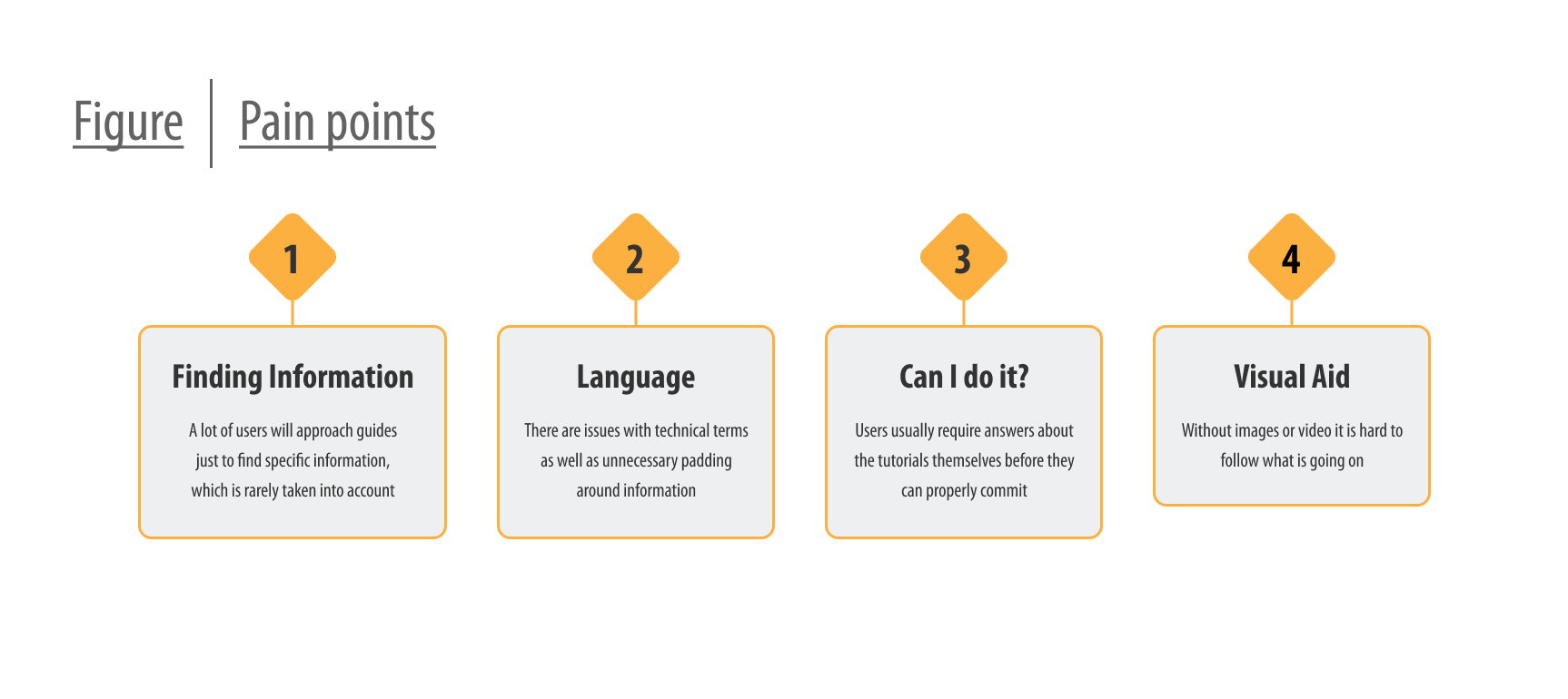
When looking at existing website dedicated to tutorials, or resources for finding them (such as Instagram or YouTube), I found that none took this into consideration. If you wanted to find something in any given tutorial it required scrolling a long page or skipping through a video. At best one could hope for a table of content and numbered sections, though it never solved the scrolling or skipping.
Personas and their journey
My interviews were turned into empathy maps, and out of those I aggregated two personas that got to represented the two major philosophies which I found among my participants: those that undertook a project to meet a direct need, and those that undertook them because they wanted to try it. The personas diverged in reason and what they were looking for, but the process and pain points had a fair bit of overlap. Both journeys had them look at multiple tutorials before finding what they were looking for, and could thus mean sifting through a lot of information.
THE DESIGN
- Wireframes
- Low-fidelity prototype
- Usability studies
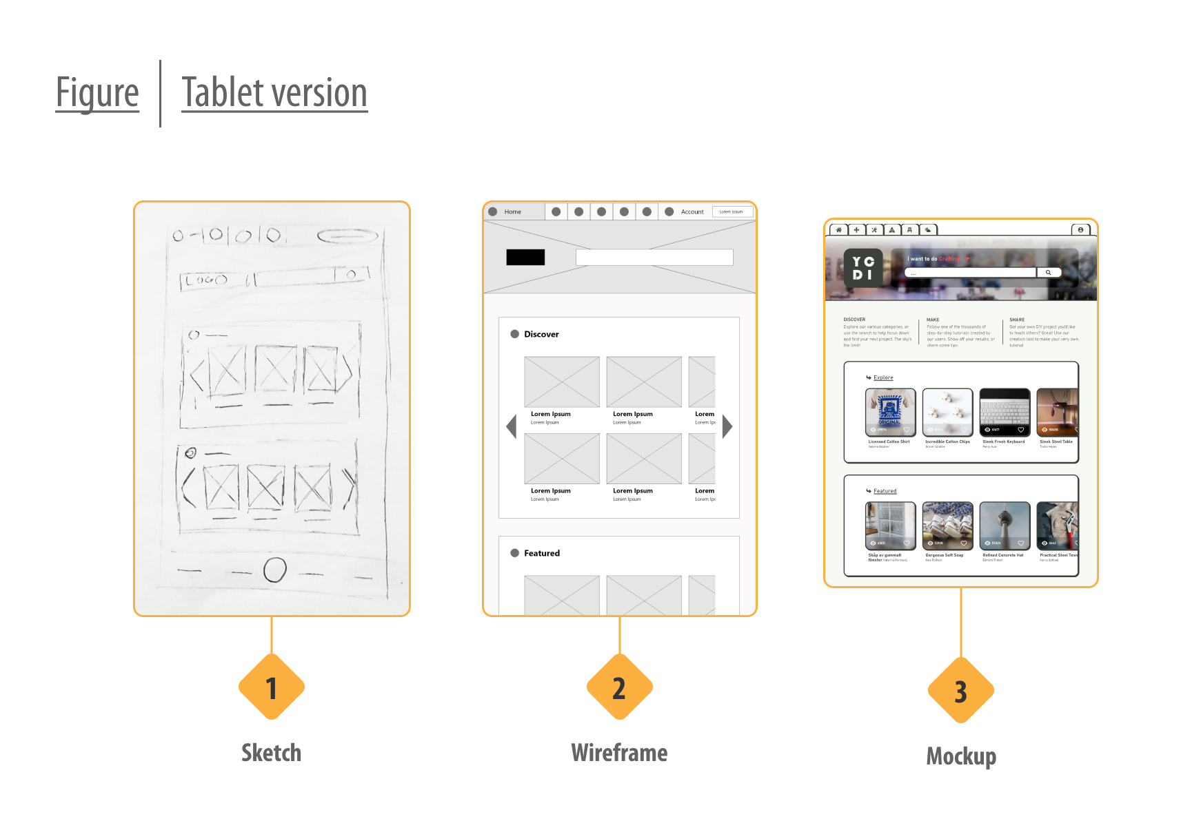
Sketches and wireframes
For the scope of the project I wanted to explore ways to find what you need from a tutorial, as well as how to find the tutorial itself, to keep with the theme of non-linearity. Plenty of ideas cropped up during ideation, and one that stuck was having broad categories that captured the variety than found in DIY. Another one was having a very prominent search function that would help the user focus down their results after the initial result by giving suggestions based on content and previous activity.

Making the guides less linear
The biggest challenge would be how to present the tutorials. A major idea that stood out in the sketching phased was having each tutorial divided up into multiple segments to more easily get a overview of, as well as a menu that allowed the user to navigate between them. When the sketches were turned digital, the segments were further enhanced with tags that would help identify sections, and adding more resources to the menu such as necessary tools and materials, things that had been flagged as important by the initial participants.
Usability study and takeaway
Wireframes were then turned into a prototype into which I adapted an existing tutorial aimed at testing how users would go about interacting with it. Participants were largely sourced from similar demographics as those who were interviewed, with a couple of outliers. What I learned was that all who searched would focused their results at least once, the people had differing expectations on the category names, and only a few ended up finding and interacting with the tutorial menu. The last part led to a lot of scrolling among everyone, but those that eventually found the menu kept using it for the rest of the study.
THE DESIGN
- Mockups
- High-fidelity prototype
- Accessibility
Creating the mockup
Unlike my previous project, which had allowed me to get in-depth with Figma, this one wanted me to learn Adobe XD. As a way of familiarizing myself with the software, I opted for an component based design, creating many of the individual pieces before placing them on the page. Sadly, I found out later that a lot of the components I designed would not be able to present my design as wanted due to limitations in the software.
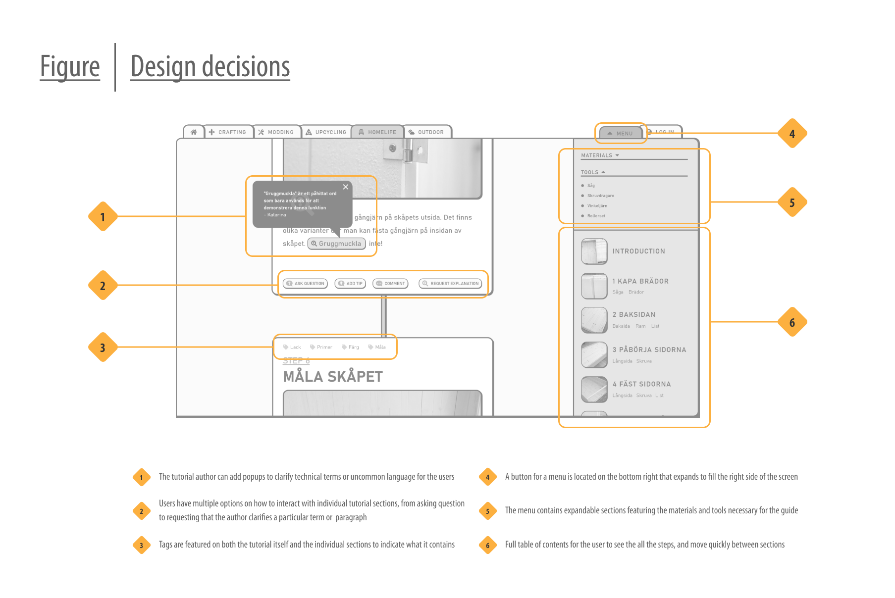
Learning from the usability study I made sure that icons were always accompanied with text to clearly indicate the intended use. I would also make the profiling of the categories clearer, adding a hover menu to the main navigational menu to show what the user could expect to find once they click. The categories were also associated with a color to help the user orient themselves.
Designing for multiple screens
An important part of this course was to design with multiple screens in mind, which I had already been doing since the wireframing stage. Since it had been considered at such an early stage, it proved a fairly simple task to adapt to the smaller screens, to adjustments were made long the way.
For the phone version, my initial plan had been a fairly standard phone menu at the top of the screen, but drawing inspiration from my last project I ended up creating a bottom menu that could be operated with just the thumb. This proved helpful when adapting the tutorial menu for such a small screen, where no additional real estate ended up being necessary.
Feedback from developers

To challenge myself further I spoke with developers to better understand what they would've wanted from the prototype on their end, and what were some common issues to avoid. Based on this I added examples on how to deal with titles that can have variable lengths. My stickersheet was populated to include button variations, animations, annotations and focus orders that would all be helpful when handing off the document to developers.
Final design

A full userflow was created with the desktop version as a base, and the prototype can be found at end of the case study. Due to the limited scope of the project, I only created an additional prototype for the phone version, which can be found here.
FORWARD
- Takeaways
- What I learned
- Acknowledgement
Takeaways
It's hard to know if I best solved what I set out to do, but what I can say for certain is that I identified issues by users that are currently being ignored, and I made an attempt to address them. Even within the limited scope of this project the reception I received from participants was very positive, at times enthusiastic. To me, that speaks that I created something nice.
What I learned
Having gone through this entire process already quite recently, I had a lot with me right from the star, giving me a better understanding of how the different parts fed each other. This allowed me to expand as I grew more confident and could allow my own form language shine though. I found myself having a lot more fun when the concern was less learning new, and more on growth and experimentation. Think I learned a bit about myself as well.
Acknowledgement
This round I had a much larger pool of participants at the early stages, which made my research so much stronger to build upon. I've also had the support of developers that helped by sharing their perspective on the design and helping me take their needs into account as well.


If it piqued your interest, or you're just interested in having a chat:

.svg)
What’s a Rich Text element?
The rich text element allows you to create and format headings, paragraphs, blockquotes, images, and video all in one place instead of having to add and format them individually. Just double-click and easily create content.
Static and dynamic content editing
"efadfgahdh in mah head, but only if you don't allow it to go to far, yknowwhatimsayin. But please, do something stupid in my name, see if I care or not."
~ Jesus
A rich text element can be used with static or dynamic content. For static content, just drop it into any page and begin editing. For dynamic content, add a rich text field to any collection and then connect a rich text element to that field in the settings panel. Voila!
How to customize formatting for each rich text
Headings, paragraphs, blockquotes, figures, images, and figure captions can all be styled after a class is added to the rich text element using the "When inside of" nested selector system.
Normal text mtoherfuckers, it's so we can get better understanding of how text will flow in the context of the rest of the page. Which includes quite a bit of typing bullshit when you do it all by hand. But that's okay. I'm used to it. I've done it before. The context might seem loose but no matter, in the end I think the overlaying idea is easy enough to understand.
Normal text mtoherfuckers, it's so we can get better understanding of how text will flow in the context of the rest of the page. Which includes quite a bit of typing bullshit when you do it all by hand. But that's okay. I'm used to it. I've done it before. The context might seem loose but no matter, in the end I think the overlaying idea is easy enough to understand.