Handy website for a Horse Club, part 1
I was contacted by Nybro Ridklubb, a horse club from my hometown. Their website had proven hard to maintain and update, leaving the staff to rely on email, social media and word-of-mouth to reach their member. As the current service was running out, they hoped to get a new and better one, that would be easier for themselves to maintain and keep updated. I also sold them the idea to look into their demographics to see if there would be some user pain points we could address as well. Good thing I did!
Hypothesis
With a solid enough website it will be possible to turn it into a tool that is both easily maintained by laymen, and makes it simple for users to find the information they need.
MY ROLE
It was my responsibility to do initial research,, produce paper- and digital wireframing, mockups, low- and high-fidelity prototypes, conduct usability studies, account for accessibility, iterate on feedback at every step, and later produce the website itself.
THE USER
- User research
- Pain-points
- Personas
INITIAL FINDINGS
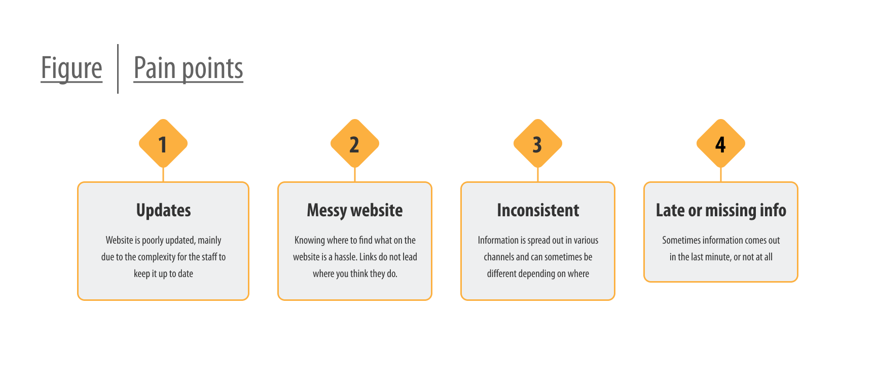
The staff running the horse club were all fairly aware of the issues that their website had at the time, and they could give me a pretty good idea of what their demographic looked like. A survey was still conducted with the association members in hope of getting a better idea of who the users were. A whooping 60% of the members responded, giving me a solid foundation to build upon. I learned who their were, what information they usually looked for and where, and I learned, importantly, that 90% of them mainly used phones to look up information.
PAIN POINTS
Besides the known issue regarding updates being tough, a major issue that was made clear to me through after the survey was that many of the users had issue locating specific information. Website was a mess, with poor indication where the users expected to find what. Looking at other local horse clubs, even in big cities, told me that the issue wasn't unique for Nybro. Menu upon menu, and subpages everywhere.

A lot of the issues could be related to the trouble the staff had with maintaining the website. The ease of update would have to be addressed at a later stage, but since there was a limit to the deadline, we decided to focus on what would be shown towards their members first.
PERSONAS AND THEIR JOURNEY
Among the respondents, two groups stood out the most. One was students of the riding club, and frequently attended lessons. The other were the mother's of younger students, who needed to keep track of things for their children. Overall while there were some overlap in goals and frustrations, they were distinct enough to form the base for two personas that I could work around.
THE DESIGN
- Wireframes
- Low-fidelity prototype
- Usability studies
IDEATION, SKETCHES AND WIREFRAMES
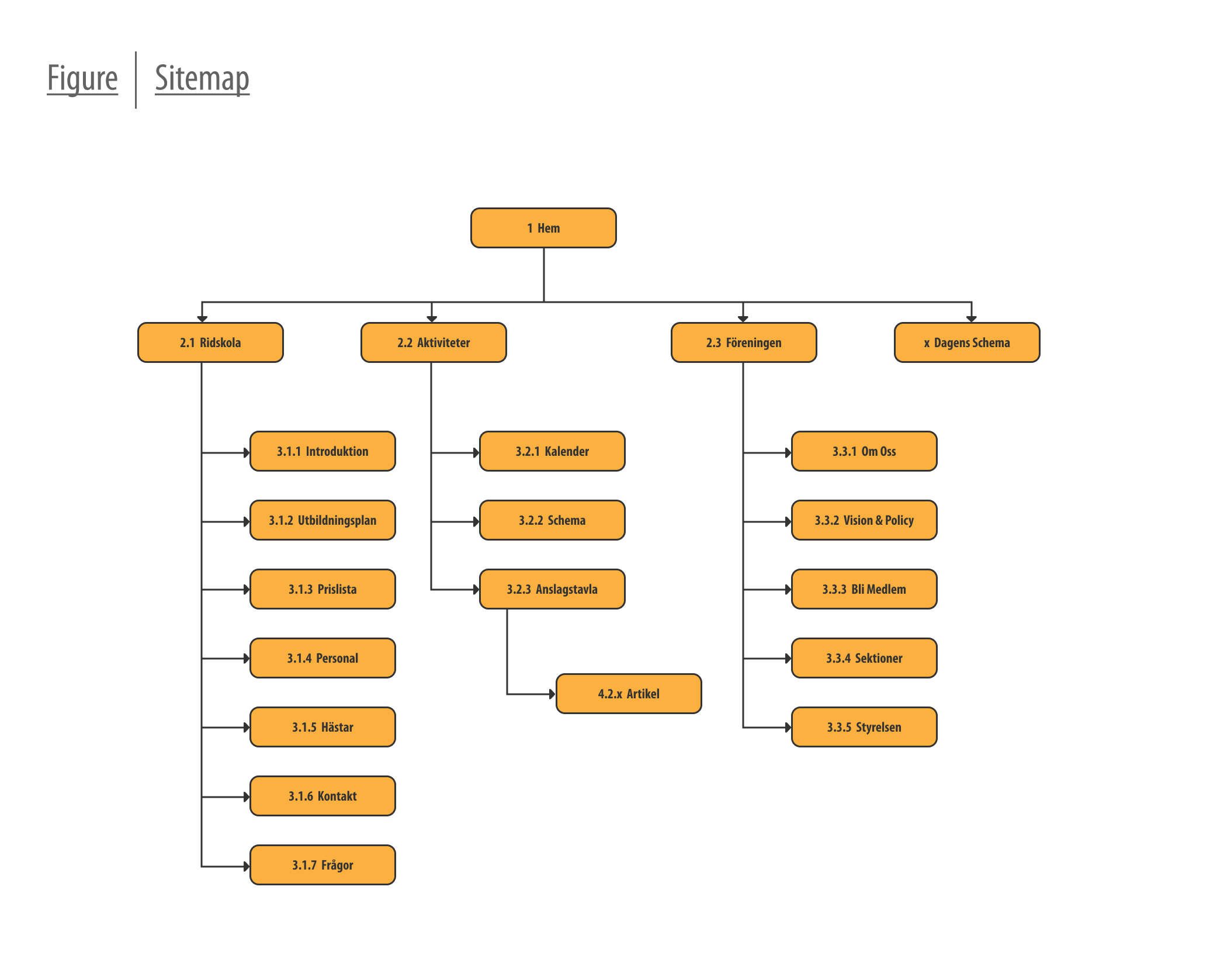
I knew from my research that one of the most important things would be to make the website as concise as possible. Didn't want to run into trap that other horse clubs did with too many pages. To solve this I would just have three drop downs in the menu. Two of these would be have most of the static informational content concerning the school and the association. Last one, dubbed "Activities", would be where users would be able to find dynamic content such as news, upcoming events and schedules.

TURNING THE MOBILE-SITE INTO A HANDHELD TOOL
The "Activities"-umbrella would be were the meat of the pain points would be addressed, and given the users' predisposition to using mobile phones to access information, I needed these pages to be especially easy to use on the smaller screen. Navigation was made to mirror app menus, reachable with a single hand. The three pages which populated this section were made to fit into the phone screen with little, if any, need to scroll. Also added was a possible overlay for a different schedule, featuring a daily schedule that could be updated with short notice to let members know what parts of the facilities would be in use that day.
USABILITY STUDY AND TAKEAWAY
Sketches I had made were turned into an initial prototype and conducted remotely with the help of the client. The test mostly revolved around navigating around, and to see if they could figure out where to go to look for information. What I learned was a that redundancy helped, that some page-names were unclear and that some did not notice that the button named "Daily Schedule" was there, but those that did find it thought it was very useful. Overall was my biggest takeaway that it was hard testing navigation and information-finding on a low-fidelity prototype
THE DESIGN
- Mockups
- High-fidelity prototype
- Accessibility
CREATING THE MOCKUP
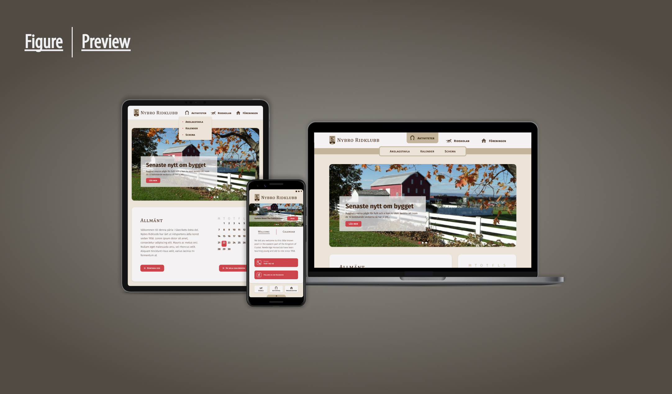
Despite having existed a while, the association didn't have much in the way of a set graphic profile. A logo with a few brown colors, and an accompanying serif-font for the name. I used this as a base and set a small design system together with the client. Complimentary white and red colors were added, as well as a second more screen-friendly font for text. Eventually the design for my envisioned handheld tool emerged, and the client seemed pleased. When we checked in with the users, the response there was overwhelmingly positive.
DESIGNING FOR MULTIPLE SCREENS
While the mobile version of the site played the role of a tool, the desktop version's role was still going to be that of a website. I wanted to keep the simplicity of the handheld versions to avoid to not reach the clutter which I had seen from other clubs. The homepage was made friendly and welcoming, while the rest were kept simple and scaled back. Due to time constraints, no considerations were made for additional screen sizes as this point, but as I was going to develop this myself I knew there would be time to put effort into that in the future.
FINAL(?) DESIGN

In the end a design emerged, that both I and the client were happy with. A design system had been established and while there were still some considerations needed to be made, I knew that since I was to develop this myself, I could tackle these in a future iteration.
FORWARD
- Takeaways
- What I learned
- Acknowledgement
TAKEAWAYS
With positive feedback from both client and users, I believe I have designed a website that will be able to address the majority of user pain points. Perhaps not in this first iteration, but the design has been made scalable to be able to handle a certain amount of increased needs. I look forward to see where this project takes me going forward as we enter the next phase.
WHAT I LEARNED
Biggest challenge by far was the need to adapt and prioritize due to delays on both mine and the client's side. It was helped by the fact that I knew that I would be developing it myself, and could thus postpone things things that needed less input from the users. As we enter the next phase, I will try and bite-size my projects so that each step becomes a sensible challenge.
ACKNOWLEDGEMENT
This would not have been possible without the support and work put in by Nybro Ridklubb. As I am located quite a bit away, they helped me reach out to their members and its thanks to them that I could such fantastic response on the initial survey.
If it piqued your interest, or you're just interested in having a chat:

.svg)
What’s a Rich Text element?
The rich text element allows you to create and format headings, paragraphs, blockquotes, images, and video all in one place instead of having to add and format them individually. Just double-click and easily create content.
Static and dynamic content editing
"efadfgahdh in mah head, but only if you don't allow it to go to far, yknowwhatimsayin. But please, do something stupid in my name, see if I care or not."
~ Jesus
A rich text element can be used with static or dynamic content. For static content, just drop it into any page and begin editing. For dynamic content, add a rich text field to any collection and then connect a rich text element to that field in the settings panel. Voila!
How to customize formatting for each rich text
Headings, paragraphs, blockquotes, figures, images, and figure captions can all be styled after a class is added to the rich text element using the "When inside of" nested selector system.
Normal text mtoherfuckers, it's so we can get better understanding of how text will flow in the context of the rest of the page. Which includes quite a bit of typing bullshit when you do it all by hand. But that's okay. I'm used to it. I've done it before. The context might seem loose but no matter, in the end I think the overlaying idea is easy enough to understand.
Normal text mtoherfuckers, it's so we can get better understanding of how text will flow in the context of the rest of the page. Which includes quite a bit of typing bullshit when you do it all by hand. But that's okay. I'm used to it. I've done it before. The context might seem loose but no matter, in the end I think the overlaying idea is easy enough to understand.


