Designing a smarter inventory app for smaller businesses
Inscan was developed as an idea for a tool aimed at small- to middle-sized businesses, to help them update and keep track of their inventory on the go. It innovates the process by utilizing smart AI technology to quickly accomplish tasks that currently take up a lot of time. Through automating a big part of the process, while still allowing for full control when need be, I sought to reduce the monotonous and time-consuming task of updating and managing an inventory.
Hypothesis
Innovation has been minimal when it comes to inventory management, and the user experience at large remains unchanged. By utilizing modern technologies, it's possible to change the process to become easier and quicker.
My role
I played the part of a UX design student designing an inventory management app, taking it from initial concept to delivery. It was my responsibility to do initial research, conduct interviews, produce paper- and digital wireframing, mockups, low- and high-fidelity prototypes, conduct usability studies, account for accessibility, and iterate on feedback at every step.
THE USER
- User research
- Pain-points
- Personas
Initial findings
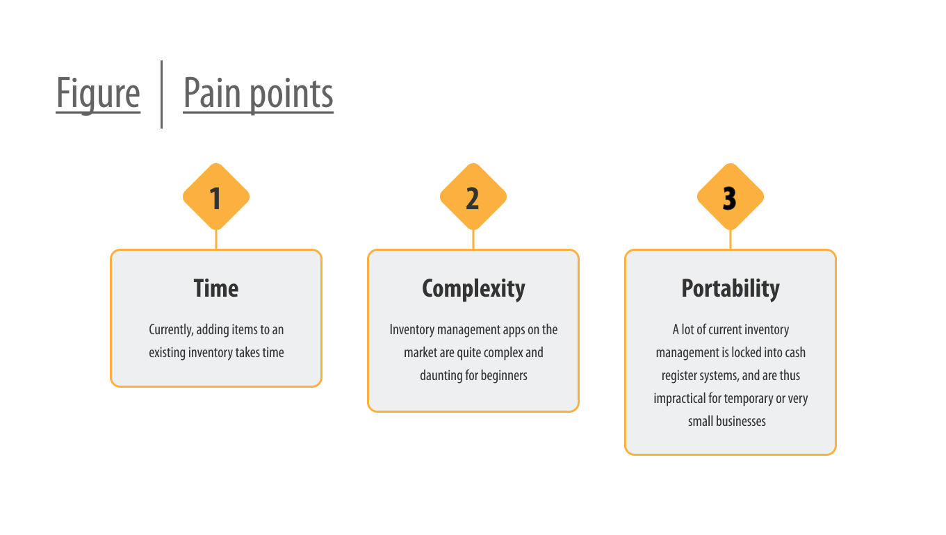
I began by interviewing those with experience working in retail and managing deliveries, and supplemented it with my own experiences working with handling deliveries and taking stock. I came to understand that current management systems are very robust, with plenty of features and interwoven functionality. Tackling one it in its entirety would certainly be outside the scope of one person for the duration of this assignment.
Limiting the scope
During the early stage I did become aware of a potential blind-spot that was worth investigating further. Updating stock usually meant scanning products or manually changing individual numbers, sometimes both, and repeating the process in a very wasteful use of time. Certainly, there ought to exist better ways of going about it, and the comment from one participant got me thinking.
"I don't see why I can't just take a delivery note and scan the whole thing. The notes are practically identical, even if they come from different places."
~ Participant
Audit
Next I went on to perform a competitive audit on various management systems available, to experience how they operated, and to check if there's been any innovation. I did discover that those that utilized a smartphone made use of the camera to allow the user to scan barcodes or specialized QR codes that you could set up yourself. This still meant a lot of scanning, but on the plus side it did get rid of the need of dedicated workstations and specialized equipment by using a tool a lot of people already have access to.
Setting a preliminary goal
While what I found during the audit was a step in the right direction, I felt like it didn't take it far enough. A participant pointed out to me that the delivery notes they receive is largely similar, they contain the same information, just displayed differently. Technology to take what is written on paper and make it digital already exists, so if it were to be combined with an AI to interpret the relevant information from delivery notes, it would be possible to reduce the current scanning process down to a single thing.
Kim's journey
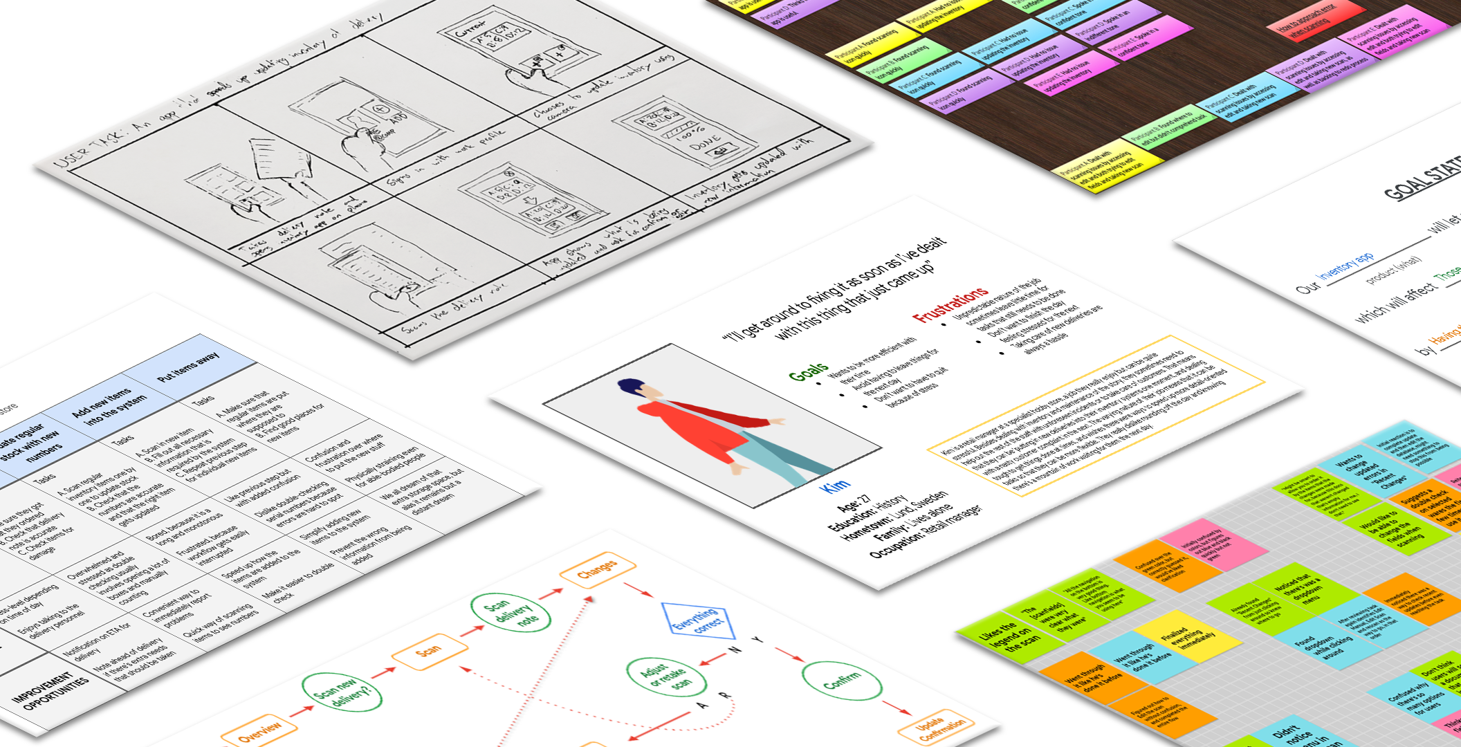
Next I created personas, of which Kim became my primary one. Kim is a store manager who doesn't like being tied up with single tasks for too long, because they might need to take care of emergencies that arise. By mapping out their user journey, I got to know them and their pain points better, and could use this to further concretize the goal of simplifying their work process.
THE DESIGN
- Wireframes
- Low-fidelity prototype
- Usability studies
Wireframes
My flow for the app centered around scanning delivery notes using the phone camera, and using that information to make an update to an inventory. For this I sketched out the screens I thought I would need. One to scan, one to review the scanned information, and one to upload the final result. Since the app relied on AI, there would need to be tools to correct and adjust what the app interpreted from the scan, and I added an edit screen. Lastly I sketched out a dashboard to give the user an overview of inventory status recent changes.

Early accessibility concerns
At this point I also realized it would be good to make it so that the updates could be done using only one hand, to accommodate people with disabilities and take into account that the user might only have one hand available. To accomplish this I made the most important buttons for the updating process available in the bottom of the screen, using large buttons to make them easier to press.
Low-fidelity prototype
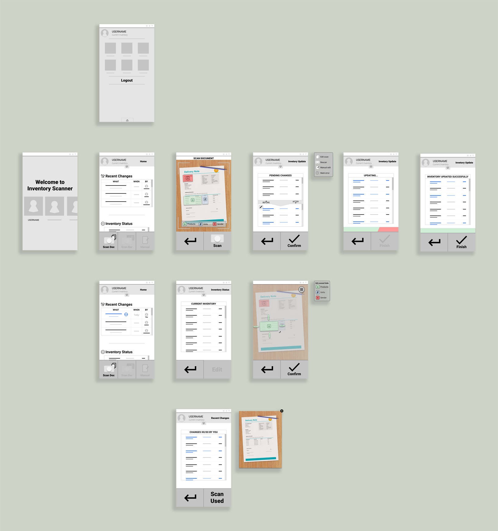
Using the final sketches as base, I transferred them to digital and refined them into a prototype, adding a few screens that I thought would prove useful when testing. After putting participants through an unmoderated usability study, I garnered that there were need for more ways of dealing with errors that might arise, and that I needed to make elements clearer in what they do. I took this with me as I moved on to the next step.
THE DESIGN
- Mockups
- High-fidelity prototype
- Accessibility
Creating a mockup

For the the overall design I wanted to avoid two of the main visual trappings I came across during my analysis of other systems. They tended to be both sterile, and lack cohesive thought put into their use of color. The sterility I dealt with by using rounded shapes to frame the many rigged lists that make up the focal point of any inventory management system. To break up the monotony, I added characters to the background aiming to also humanize the experience a bit.
Choice of color
I kept the overall color scheme for the app muted with a warm accent color to give it its own identity, because I knew I wanted to use additional colors to denote status changes and I didn't want to overwhelm the user. Those colors got reused where it didn't make sense to have uniform colors, but I took steps to avoid it becoming confusing by adding clarifying elements.
Further accessibility considerations
To make it less daunting for first time users, I reduced elements that are visible they first log in, replacing it with information to help them get familiar with the app and its core function. Once the user got more used to it, this text would be replaced with functions that are more useful to them.

Since scanning and having an AI read a delivery note is the most complex part of the app, I added help buttons to those screens. This wouldn't just prove useful to beginners, but to more experienced users of other systems when they're dealing with the aspects that make this app unique.
High-fidelity prototype
I went on to create a new prototype based on the mockups, and with it I conducted an additional round of testing. Results were overwhelmingly positive as they have little trouble completing an inventory update. The few hiccups that arose turned out to be highly individualistic, with little emerging in the form of problematic patterns.
Iterating on feedback
Despite nothing critical being discovered during testing, I got multiple suggestions to further improve the design. This led me to add additional features, such as having a double check for new users to ensure they perform tasks accurately, and giving error messages for when the user does things the app doesn't want them to.
Mockup of the final design
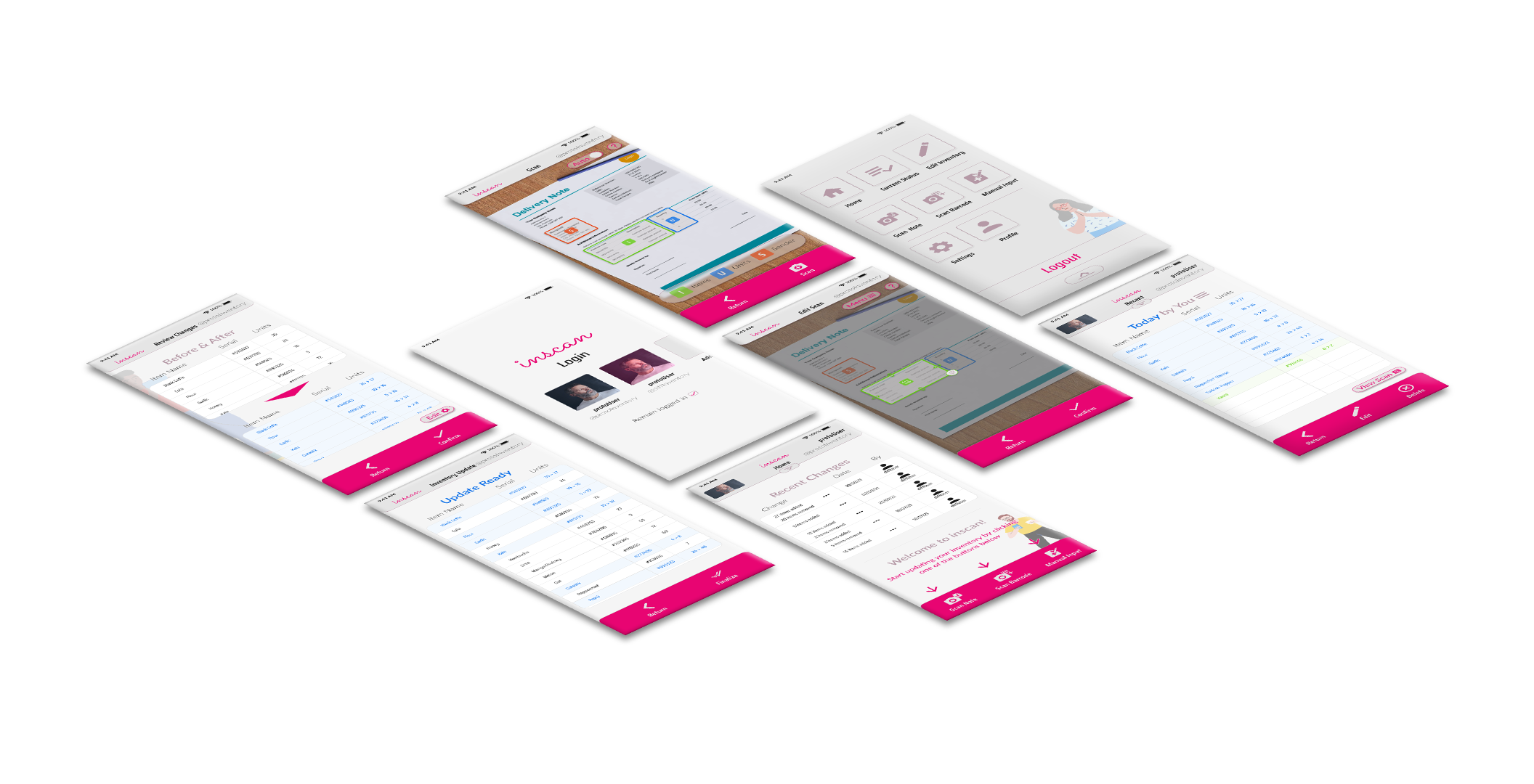
After the last round of revisions to the design, I reached the endpoint of my project. Satisfied with the result I felt confident that I had met the brief and reached the goal that was set down by my research.
FORWARD
- Takeaways
- What I learned
- Acknowledgement
Takeaways
In the end I accomplished what I set out to do. From what my final testing told me, the app concept would allow for a less time-consuming experience when managing and updating an inventory. Had the project progressed further I would have worked more in-depth on how to deal with potential errors and looked into how the app would handle the management aspect itself. But for the scope of the project it does a good job on showing how tedious work can be made simpler by thinking a bit outside of the box.
What I learned
This project has been instrumental in allowing me to familiarize myself with the role of a modern UX designer. Having previously studied interaction design, a lot of it was familiar, but the reading and studying I did alongside it gave me an updated and more fleshed out impression of what it means to design with the user in mind. As I was alone on this project, I had to shoulder all responsibility of every step, and it was on me to ensure that what I did was good enough. Safe to say I learned valuable lessons along the way and became quite handy at working with Figma.
Acknowledgement
I don't think this would've been possible if not for the mountain of material, lectures and readings to take me through the design process, one step at a time. Coursera and Google's course in UX design have been a ton of help and an instrumental part in my journey back into user centered design.
If it piqued your interest, or you're just interested in having a chat:

.svg)
What’s a Rich Text element?
The rich text element allows you to create and format headings, paragraphs, blockquotes, images, and video all in one place instead of having to add and format them individually. Just double-click and easily create content.
Static and dynamic content editing
"efadfgahdh in mah head, but only if you don't allow it to go to far, yknowwhatimsayin. But please, do something stupid in my name, see if I care or not."
~ Jesus
A rich text element can be used with static or dynamic content. For static content, just drop it into any page and begin editing. For dynamic content, add a rich text field to any collection and then connect a rich text element to that field in the settings panel. Voila!
How to customize formatting for each rich text
Headings, paragraphs, blockquotes, figures, images, and figure captions can all be styled after a class is added to the rich text element using the "When inside of" nested selector system.
Normal text mtoherfuckers, it's so we can get better understanding of how text will flow in the context of the rest of the page. Which includes quite a bit of typing bullshit when you do it all by hand. But that's okay. I'm used to it. I've done it before. The context might seem loose but no matter, in the end I think the overlaying idea is easy enough to understand.
Normal text mtoherfuckers, it's so we can get better understanding of how text will flow in the context of the rest of the page. Which includes quite a bit of typing bullshit when you do it all by hand. But that's okay. I'm used to it. I've done it before. The context might seem loose but no matter, in the end I think the overlaying idea is easy enough to understand.


